AquaLog · Brand identity, UI/UX & digital product design
From an Idea
to an Experience.
Every dive has a story worth remembering.
As an independent project, I developed the concept, brand direction, and interfaces, bringing user experience thinking together with digital product development.
AquaLog began as an exploration of how technology and thoughtful design could enhance the scuba diving experience. By bringing together ocean-inspired branding, intuitive interfaces, and digital product thinking, the project became an opportunity to develop a cohesive experience from the ground up.
App Store approval awaited · status confirmed October 28, 2026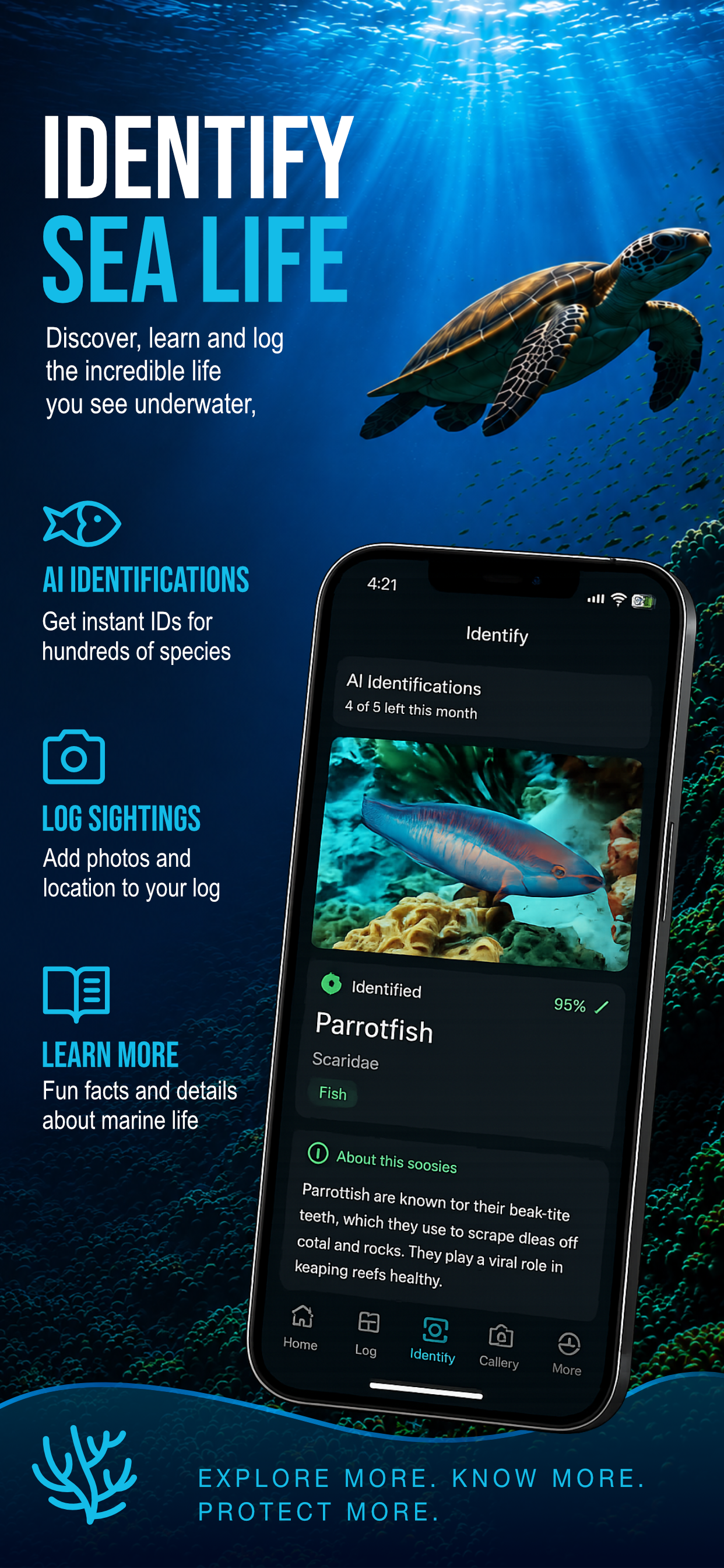
01 / The opportunity
How do you capture an experience that happens beneath the surface?
Scuba diving is about exploration, discovery, and the experiences that stay with you long after you return to shore.
I wanted to explore how a digital product could help divers organize their adventures while reflecting the beauty and excitement of the underwater world.
02 / The concept
A digital home
for underwater adventures.
The idea behind AquaLog was to create a scuba-focused digital experience that felt both useful and inviting — combining practical functionality with a visual identity inspired by the ocean.
The challenge was to make the experience approachable, intuitive, and cohesive, from the first impression of the brand to the details of the interface.
03 / Building the brand
Inspired by the ocean.
Designed for exploration.
My visual direction combines deep blue surfaces, bright aqua accents, bold condensed display lettering, and clean interface text. Ocean imagery brings a sense of exploration; clear hierarchy and repeated icon treatments help the experience feel connected.
An illustrative palette drawn from the project’s visual direction.
04 / Designing the experience
Beautiful is good.
Intuitive is better.
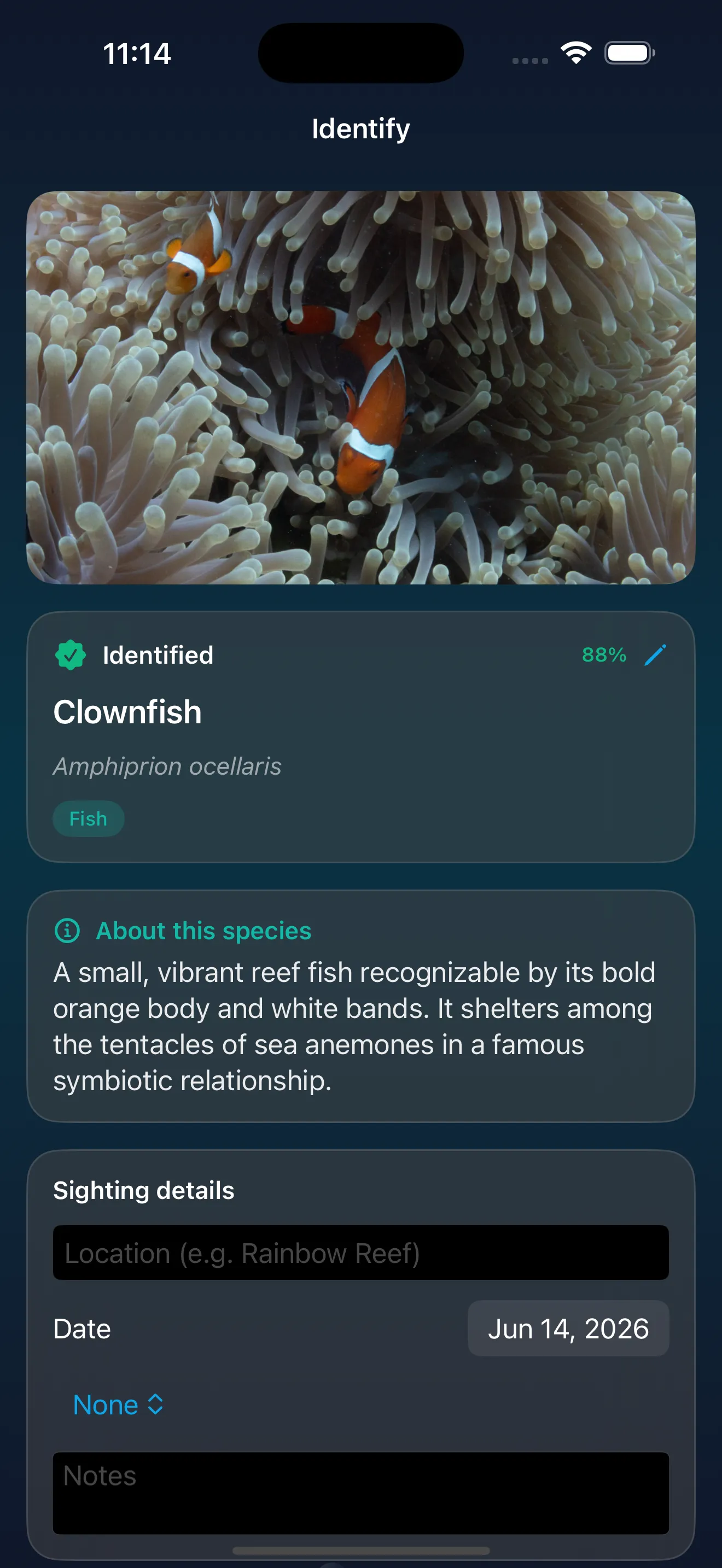
Creating AquaLog meant thinking beyond individual screens. I wanted the brand, navigation, visual language, and product experience to feel like parts of the same world. Every decision should help people understand where they are, what they can do, and how to accomplish their goals without unnecessary friction.
For AquaLog, I explored how visual hierarchy, navigation, content organization, and interface consistency could create a more seamless experience.
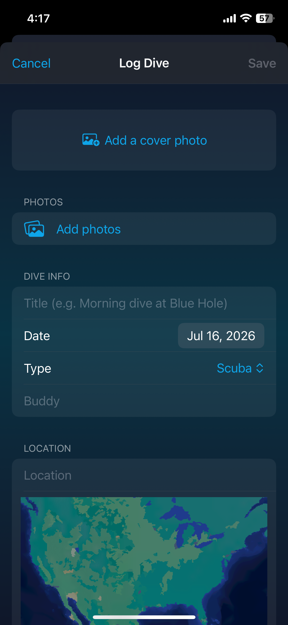
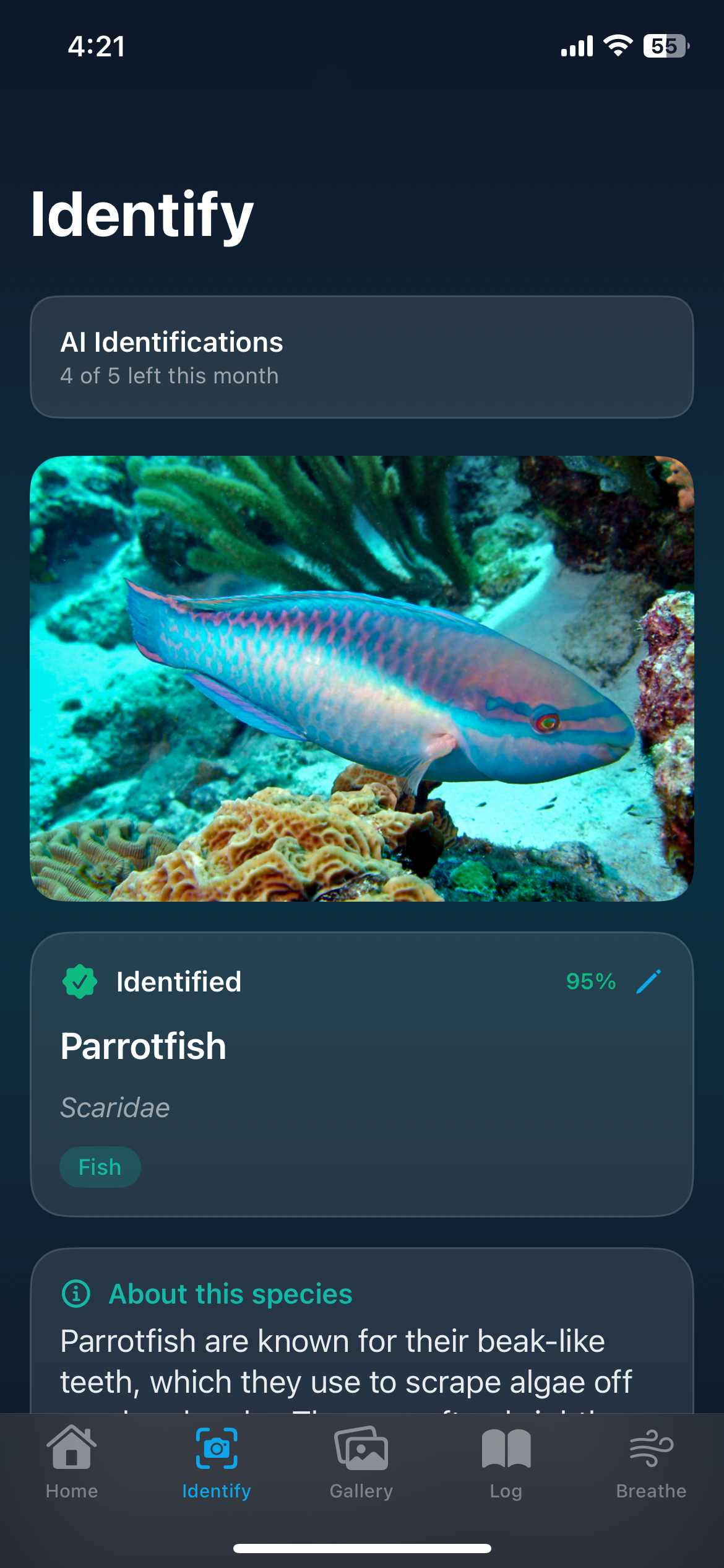
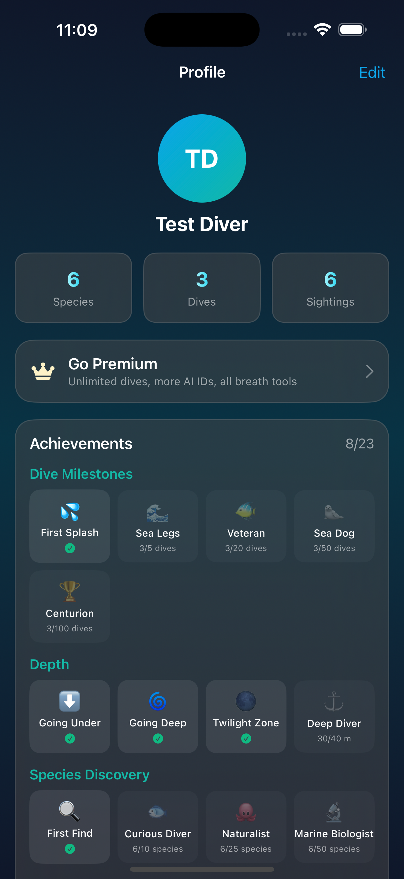
Screens are presented as design artifacts. Sample statistics, identification confidence values, and achievement counts shown within them are not product-performance results.
The identity in application
One visual world.
Across every introduction.
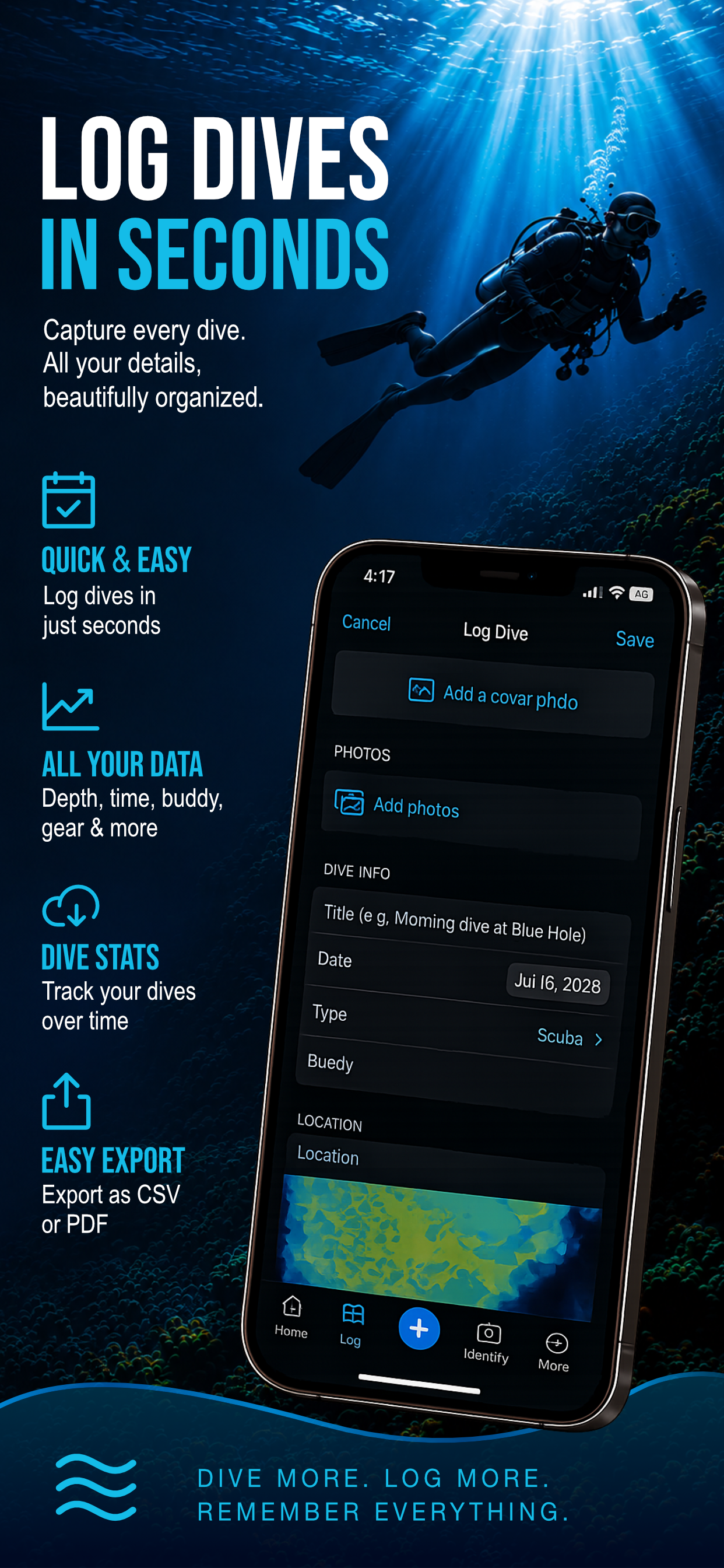
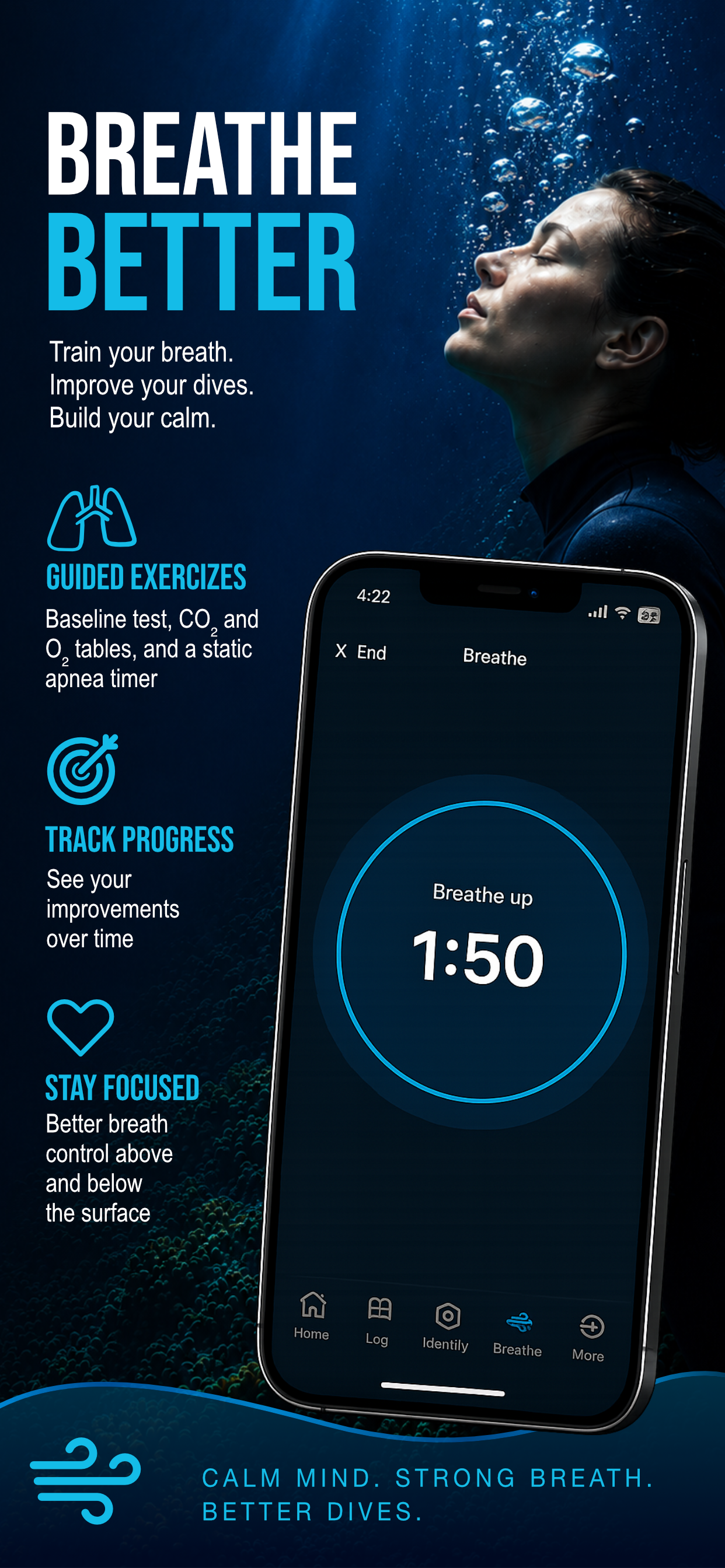
Feature statements inside the original promotional designs are preserved as supplied; they are not independent verification of functionality or availability.
05 / Design meets development
Where creative thinking meets technical curiosity.
AquaLog also gave me an opportunity to explore the relationship between design and development. Thinking through how an application works — not just how it looks — helped me consider the practical decisions behind a digital experience.
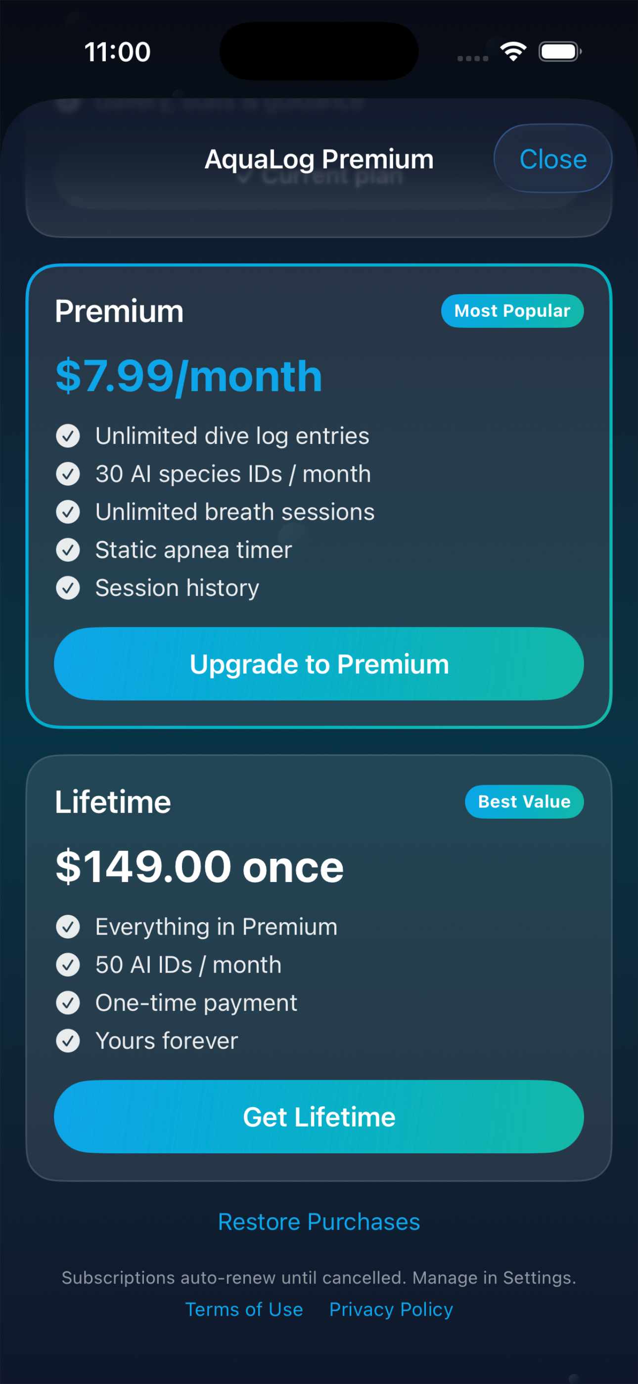
The interface and subscription designs bring product structure into the creative process: how information is grouped, how choices are presented, and how visual patterns connect the experience.
06 / From curiosity to creation
Connecting the pieces.
- 01
Explore
Identify the opportunity and define the product concept.
- 02
Shape
Connect the visual direction with the underwater world.
- 03
Design
Explore hierarchy, navigation, and consistent interface patterns.
- 04
Build & refine
Bring design and development together, revisiting decisions as the experience takes shape.
07 / The outcome
An idea
with room to grow.
AquaLog represents the kind of work I love most: connecting creativity, problem-solving, and technology to turn an idea into something tangible.
It reflects my curiosity about how brands and digital experiences can work together — and my interest in building things that are both meaningful and enjoyable to use.
The takeaway
“The best digital experiences make the complicated feel effortless.”
For me, that means connecting strategy with visual clarity and technical problem-solving—considering both how an experience feels and how its pieces work together.